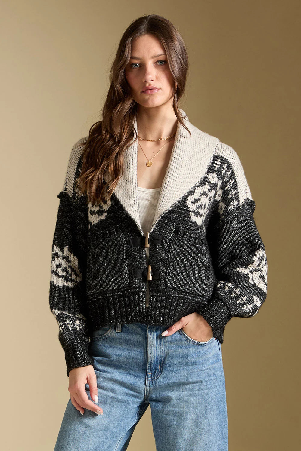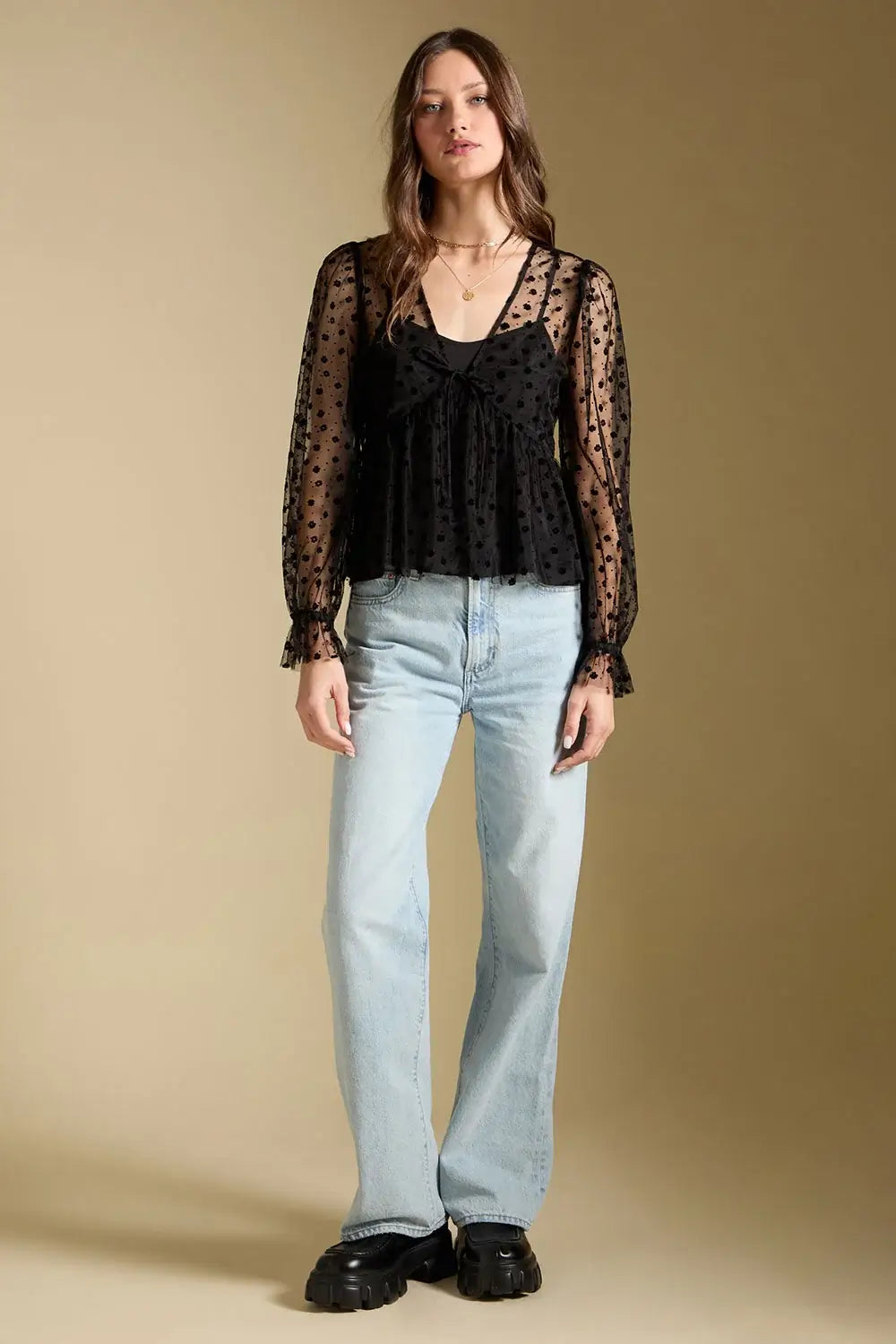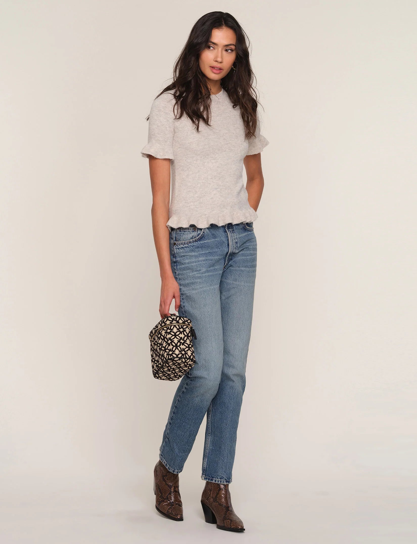
Earth tones are having a nuanced moment: less muted monotone and more a layered study in warmth, contrast, and tactile interest. This Color Stories piece looks at ways to keep the palette fresh — through contrasting hues, smart use of prints, fabric choices, and concise styling moves.
Rethink Contrast: Pair Warm Neutrals with Unexpected Accents
Rather than wearing a single brown or beige head-to-toe, introduce small, high-contrast accents to lift the palette. A deep olive blouse or jacket reads richer next to a soft terracotta or warm cream; a muted mustard belt or silk scarf can act like a light source against darker tones.
Use accessories in cooler or brighter shades sparingly — a slate-blue earring or a faded denim accessory will make earthy hues pop without feeling jarring.
Let Prints Do the Work: Pattern as a Bridge
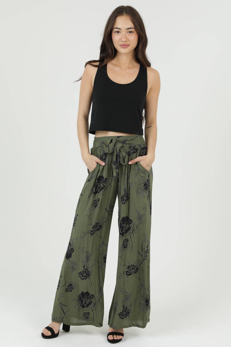
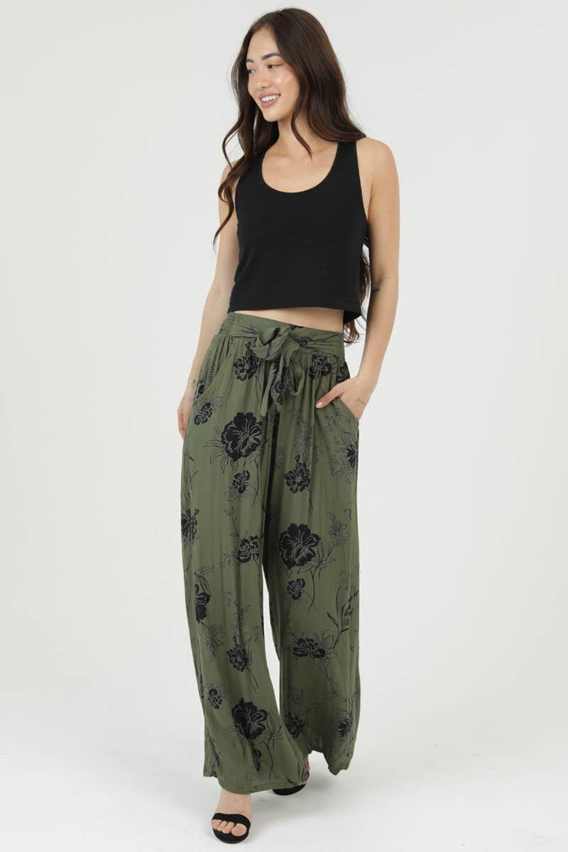
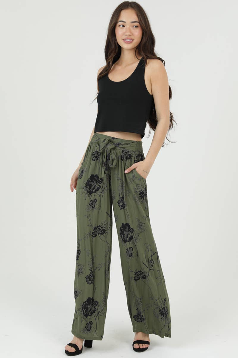
A printed garment can bridge several earth tones at once, making coordination feel intentional rather than forced. The Angie Tie Waist Wide Leg Printed Pants are a good example: the lightweight rayon and bold floral print combine multiple warm hues while the wide leg silhouette keeps the look airy and contemporary.
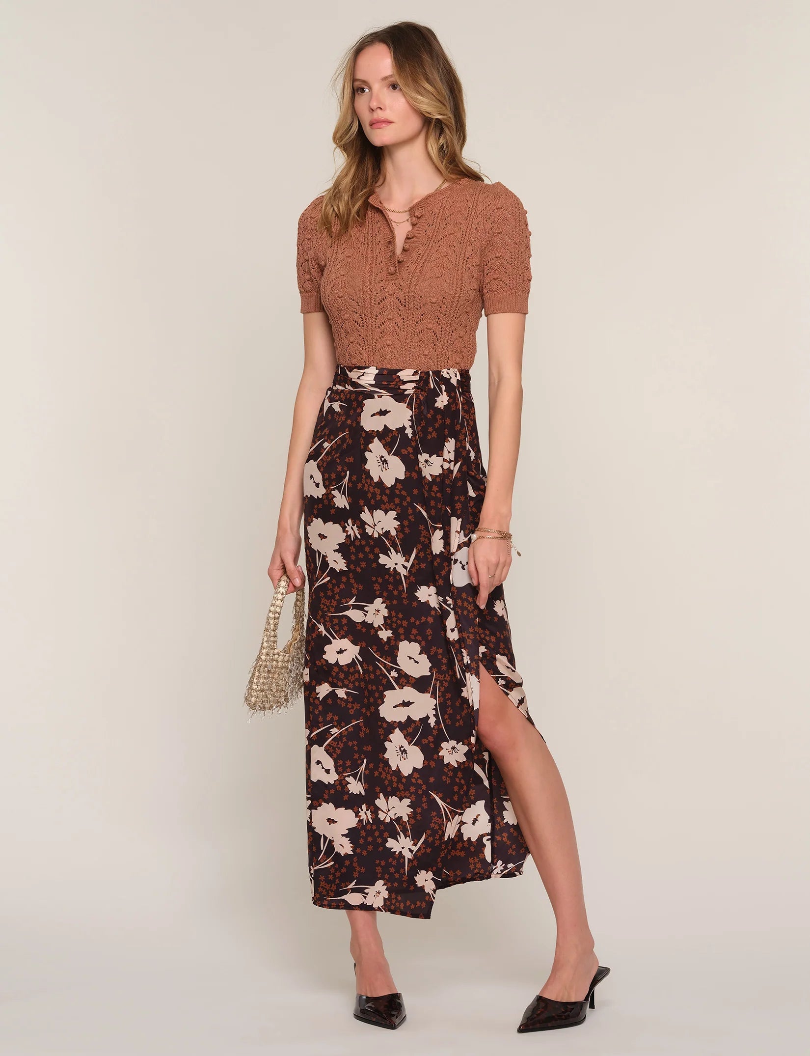
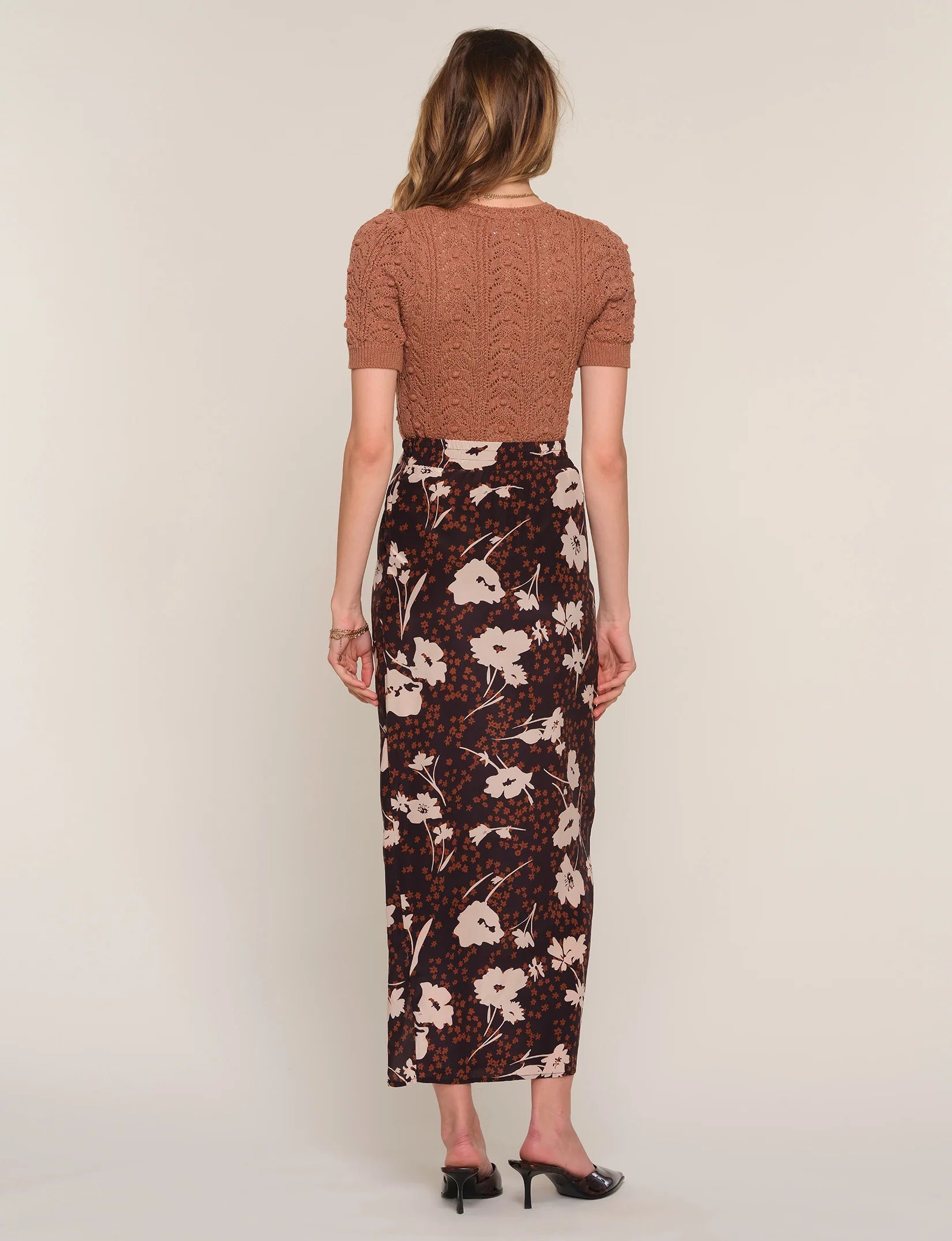
Similarly, the Heartloom Zander Skirt in Posey uses flowing crepe de chine and a posey print to introduce layered color and movement. When a single piece already contains a range of earth tones, keep the complementary items simple and textural to avoid competing with the pattern.
Texture and Fabric: How Surface Changes Perception
Different fabrics catch light and color differently. Smooth crepe de chine or polished silk-like fabrics read more radiant, while brushed cottons, knit, or sueded finishes mute and warm a tone. Mixing a matte wool or cotton with a shinier crepe or rayon will read as deliberate contrast rather than a tonal mismatch.
Pay attention to weight and drape: the Angie pants’ lightweight rayon and the Heartloom skirt’s flowing crepe de chine both emphasize motion and airiness, which helps warm colors feel lively rather than heavy.
Small Styling Moves That Brighten an Earth Palette
Trim and tailoring: a defined waist — whether via an adjustable tie or a narrow belt — adds shape and prevents warm, voluminous fabrics from overwhelming a frame. The adjustable tie waist on the Angie pants is a practical way to add structure to a flowy silhouette.
Eyes and edges: collar choices, cuffs, and hem lengths are simple levers. A cropped jacket or a half-tuck creates layering lines that break up large color blocks and keep proportions fresh. When working with prints, let one printed piece be the focus and anchor the rest with one or two solid shades drawn from the print.
Earth tones reward small experiments: swap one neutral, add a printed piece with complementary hues, or mix finishes. With attention to fabric, proportion, and a targeted accent, the palette reads contemporary and luminous.